Display color options on product cards
Product card refers to an individual product preview unit displayed in product lists, collections, or search results. It typically includes the main image, title, and price, and can be extended with additional elements such as color swatches or labels.
For products with multiple variants, Genstore supports showing available options on product cards using the color picker. When a customer selects a SKU, the main image for that color is displayed directly, helping them quickly compare styles and make purchase decisions.
Use cases
- Browse product lists / collections: On collection or list pages, customers can hover over or click a color picker option to instantly preview the product image for that color, without opening the product detail page.
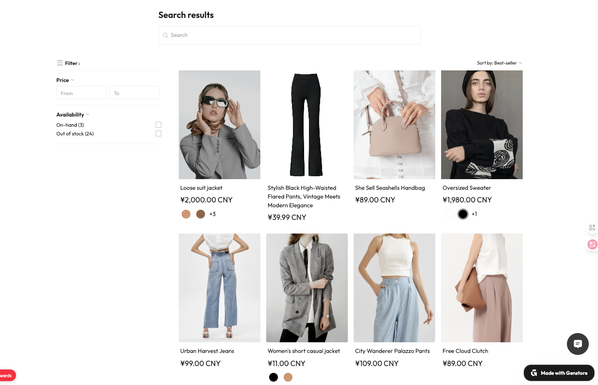
- Search results: The color picker appears on product cards in search results, making it easier for customers to identify their preferred color.
- Featured collections / promotional sections: Showing the color picker in featured or promotional blocks makes products more visually engaging and interactive.
Prerequisites
To enable the color picker and link it with product images, make sure:
- The product has multiple variants.
- One of the variant options is set as Color.
Steps
- Log in to your Genstore admin.
- Go to Store -> Online Store -> Themes.
- Click Customize next to your current theme.
- In the left-hand navigation bar, click the Style design icon (third icon from the top).
- In the Product card section, locate the Color picker settings (enabled by default). From here, you can:
- Enable or disable the color picker feature.
- Choose the display style (circle / square)
- Set the maximum number of colors to display.
- Save your changes. On the storefront, product cards will automatically show the color picker based on the color variants you configured in product management:
- On collection pages, search results, and featured sections, customers can click a color picker option to preview images for different colors.
- Hovering over or clicking an option can also reveal other available SKUs.
Additional notes
You can hide the color picker in collection and search templates from the editor’s right-hand panel. See the guides below for details: